Add A Lil' Paint Color

Choosing paint colors can be overwhelming. There are thousands of paint colors to choose from, and, on top of that, paint is tricky. A color can look great in a photo, on the sample card, or in the can, but sometimes as soon as it goes on your wall you know, "That is not it." Lighting (both natural and artificial), time of day, location, and furniture all affect the way paint looks on the wall. Your living room wall color may look blue, but once you put your gray sofa next too it, it's purple! Eek!
Painting mistakes can cost a lot of time and money. I've put together a few tips I've learned over the years and some of my favorite colors recently that will hopefully ease the stress of choosing the right paint color for your next project.
- Every room doesn't have to be a different color. Trust me: a yellow kitchen, a blue bathroom, and a green living room may seem like a good idea, but let's leave the split personalities to people not homes. Having a consistent neutral color throughout your main living space will create a balanced flow and provide a blank canvas that can be filled in with colorful accessories and fabrics. After all, if you want color in every room, it is less expensive to buy a new pillow or new dishware than to repaint your walls.
- Color goes beyond the primaries. Like most of you, I am also tired of the tan walls most often found in rental homes and new builds. "Builder Beige" as I like to call it. BUT, that doesn't mean you should paint you walls bright green. Color is an infinite spectrum. Grays and beiges are often seen as boring and lifeless, but do you know how many grays and beiges are out there?! Some grays read green, some blue, some purple. Some beiges look like the clay out west, others like a toasted bagel, and others like beach sand. My point is, you can add color to your home without sticking to the basic color wheel. Don't overlook the beautiful color that exists in the neutrals.
- Paint a sample on your wall. Don't skip color sampling, because you're ready to be done with the painting stage. Paint looks different in every space, so it is important to know that the color you choose looks good in your space. Hang a painted sample board on your wall and live with it for a day or two. Notice how the color changes throughout the day. Move it close to the window one day and in the far corner the next. Hold it next to your existing upholstery or bring it to the store with you if you're buying new furniture. It will take far less time, money, and stress to sample the paint and choose the right color than it will to skip sampling, choose the wrong color, and have to start from square one.
- Choose your paint color last, not first. This one seems to be the hardest to grasp for most non-designers. Everyone wants to choose paint colors first when moving into a new home or redecorating a room, and I understand why, but I will honestly say, it is much easier to choose a paint color for a furnished room than for an empty room. Here is why: There is an infinite number of paint colors, but there is a limited number of fabrics and finishes. Start with easiest piece to the puzzle, the piece with the least amount of options. Choose your sofa, your bedding, your rug, and then choose your paint color. Once you've nailed down your fabrics and finishes, all you have to do is hold up the paint deck to your furniture and go, "That one, that one, and that one." Trust me. Choosing your paint color as the final step is far less stressful than walking into the paint store with an empty room in mind saying to yourself, "I have no idea. All of them will work." Give it try next time, and let me know how it goes!
Now to my favorite colors from that infinite spectrum...
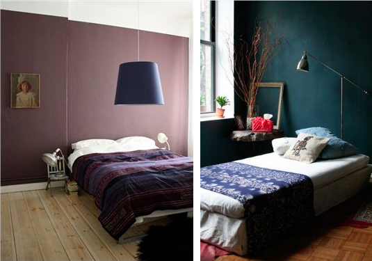
1. Enigma by Sherwin Williams - Purple has never been a favorite color of mine - I'm more of a blue and green girl myself - but a recent client wanted purple walls in her mid-century music room, so purple is what she got. And, we both LOVED it! I selected a tan leather sofa and accented the room with teal, orange, and vintage brass accessories. Purple, believe it or not, combined with the complementary colors created this amazing feminine/masculine love child. Yes. Masculine! Of course, not all purples can do that - Lavender? Um. No. - but deep, rich, moody purples like Enigma by Sherwin Williams definitely can.
2. Newburg Green by Benjamin Moore - I painted my bedroom Newburg Green a few years back, and I can't wait to paint my new bedroom that color again one day. With my sand linen duvet cover, navy blue coverlet, and antique rug euro pillows that had a bit of terra cotta in them, my bedroom was this cozy, bohemian den that I never wanted to leave. The wall color was dark and moody yet romantic and comforting. Although "green" is in the paint color's name, it appeared more navy blue in my space. Again, the importance of sampling!

3. Aloof Gray by Sherwin Williams - Aloof Gray is definitely a cool gray that reads blue or green depending on the lighting. The above room, designed by the amazing Emily Henderson, shows the beautiful airiness of this color. It feels as if you are outside enjoying the blue skies and green trees. It is so crisp and clean.
4. Mindful Gray by Sherwin Williams - Sherwin Williams lists Mindful Gray as a "cool neutral," but, from my experience with the color, I personally see it as a warm neutral. I used Mindful Gray in a small artist bungalow in North Carolina, and it has remained one of my favorite grays ever since. It is cozy and inviting, a perfect backdrop to any space.
5. Chantilly Lace by Benjamin Moore - I don't have a photo for this one, but it is hands down the best trim color ever. Ever. It is also a great wall color if you're looking for a crisp, delicate, clean white to brighten up your space.

6. Cliffside Gray by Benjamin Moore - I fell in love with this color when I first saw Nate Berkus's project pictured above on Pinterest. I've specced it for a current guest bedroom project, and I hope they decide to go with it! A cool, blue gray that is beyond fabulous when paired with contrasting warm tones.
Do you have any tips to share from your experience? What are your favorite colors?
Paint on! Rachel